Key Analytical Findings
This report triangulates UI engagement metrics, global travel volume shifts, and consumer sentiment data regarding AI authenticity from Getty VisualGPS to explain the 2026 bento grid phenomenon.
Algorithmic Arbitrage
The Bento Grid serves as a universal visual translator across global social media algorithms.[2][8][9]
- Evidence chain
- Xiaohongshu requires high visual density for saves, while Instagram prioritizes candid authenticity. The modular grid provides both simultaneously by organizing candid moments into a dense, scannable format.
- Why it matters
- The bento design theory bridges the gap between Eastern and Western digital aesthetic preferences, offering a unified visual strategy.
- Limit
- Textual metadata and captions must still be localized, even if the visual format is universally appealing.
The Premiumization of Flaws
Intentional friction and analog imperfections are the new signifiers of high-end digital design.[3][12][16]
- Evidence chain
- With 78% of consumers distrusting AI-generated perfection, creators are using mathematically perfect grids to frame and legitimize messy, real-world photos and slightly jagged digital cutouts.
- Why it matters
- Users should avoid over-smoothing their collages, as retaining natural film grain and imperfect edges maintains a premium, authentic feel.
- Limit
- There is a subjective threshold where intentional imperfection crosses into objective low quality, requiring a delicate balance.
Spatial Color Triangulation
Narrative storytelling in 2026 is driven by spatial color relationships rather than chronological sequencing.[4][13][17]
- Evidence chain
- Because bento grids present all visual data at once, the dominant hex code of the largest anchor cell must dictate the background fills of supporting cells to prevent visual chaos.
- Why it matters
- Creators must match background colors to the dominant tones of their hero photo to create a cohesive aesthetic experience.
- Limit
- This technique requires a basic understanding of color theory to avoid cognitive dissonance in the final layout.
While the bento grid is a dominant visual trend, its rigid structure can pose accessibility challenges for screen readers, requiring careful attention to visual hierarchy and alternative text.
The End of the 'Photo Dump': Why Bento Grids Rule 2026
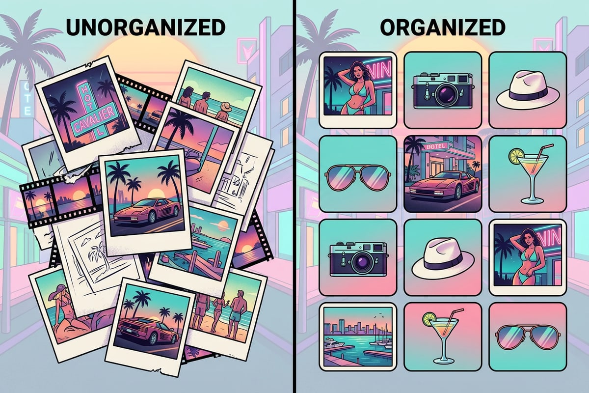
The transition from chaotic photo dumps to structured bento grids is driven by a need to manage digital information density.
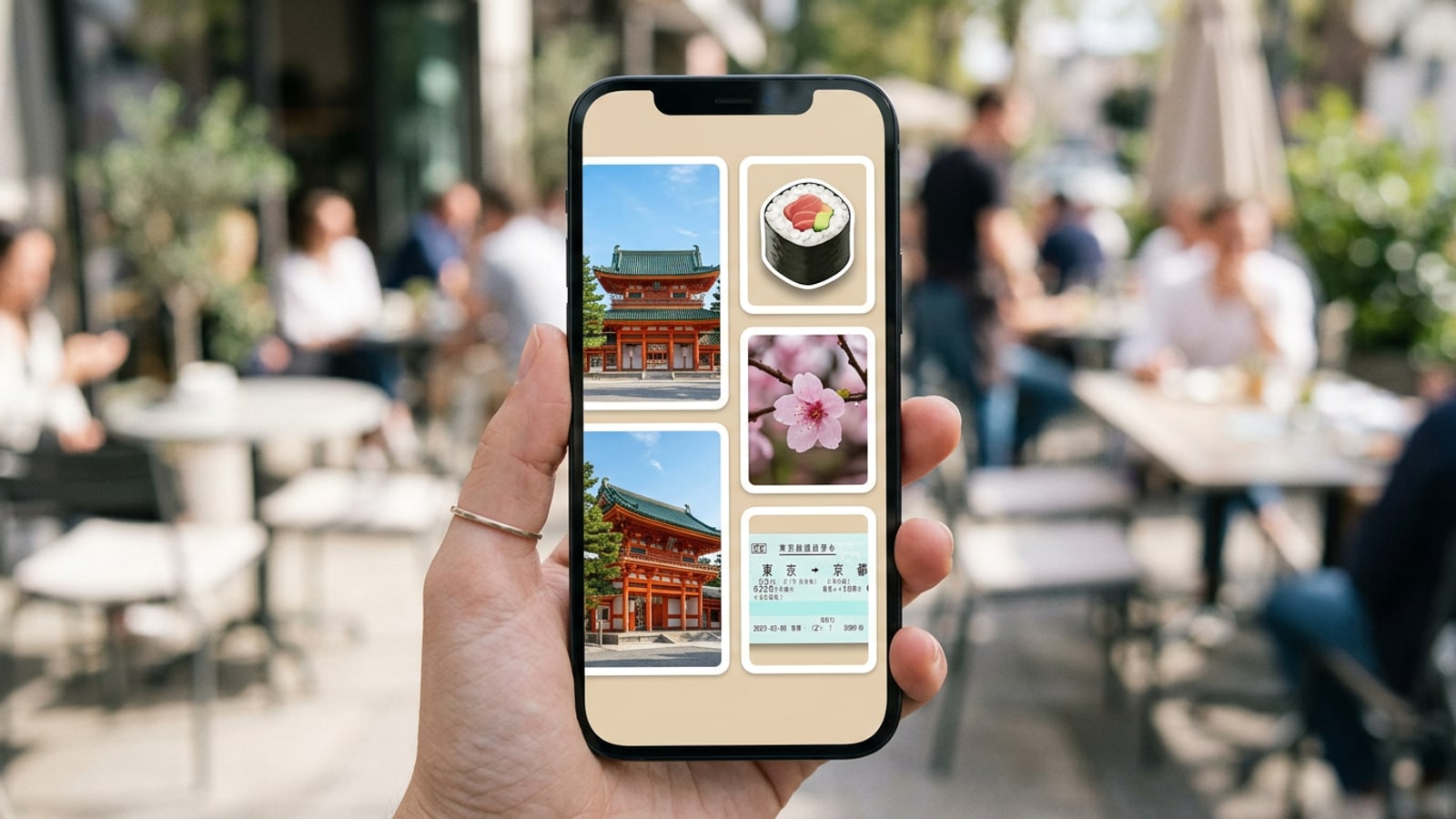
For years, the standard method of sharing summer travels was the sequential photo dump, a chaotic carousel of unrelated images. However, as digital information density reaches unprecedented levels in 2026, audience fatigue has set in. The bento grid photo collage has emerged as a cognitive necessity, offering a structured, modular alternative that allows viewers to digest multiple visual narratives simultaneously.[1][8]
Research indicates that users process information 23% faster on modularly organized layouts compared to linear streams. By compartmentalizing memories into distinct, geometric cells, the bento grid reduces cognitive load. It transforms a scattered collection of beach sunsets, museum tickets, and café meals into a cohesive, scannable dashboard of your summer experience.[1][2]
The 'Tactile Rebellion': Premiumizing Flaws
Bento grids perfectly balance rigid digital structure with authentic, messy human elements.
The rise of the bento grid is intrinsically linked to what design analysts call the 'Tactile Rebellion.' As frictionless, AI-generated imagery floods social feeds, a significant 78% of global consumers now express distrust toward flawless digital perfection. In response, creators are seeking ways to inject human authenticity back into their visual storytelling.[12][16]
The bento grid provides the perfect framework for this rebellion. The grid itself is mathematically rigid and perfect, which acts as a legitimizing skeleton. Within these perfect cells, creators place messy, real-world artifacts: slightly jagged digital cutouts of gelato cones, grainy film photos, and scanned transit passes. This juxtaposition of perfect structure and imperfect content signals high-end, intentional design.[3][12]
Anatomy of a Bento Grid: Hierarchy, Anchors, and Gutters
Understanding the structural rules of modular design is crucial to preventing your collage from looking cluttered.
A successful bento grid photo collage relies on strict structural rules. Without visual hierarchy, a dense collection of photos quickly devolves into visual noise. The most critical element is the anchor cell, typically a 2x2 or larger block that draws the eye first. This cell should contain your strongest, most compelling travel photo, establishing the theme and color palette for the entire layout.[1][9]
Surrounding the anchor are supporting 1x1 or 1x2 cells, which house detail shots, textures, or isolated objects. The negative space between these cells, known as gutters, must be uniform. Consistent gutter width is what gives the bento grid its satisfying, snapping geometry, providing breathing room that guides the viewer's eye from the anchor to the supporting details.[1]
- Always designate one large anchor cell to establish visual dominance and theme.[1]
- Maintain uniform gutter widths to create a clean, professional aesthetic.[9]
Aesthetic Strategy: Spatial Color Triangulation
Unify disparate travel photos by matching background fills to the dominant colors of your anchor image.
When combining photos from different locations, lighting conditions, and times of day, color clashes are inevitable. In 2026, narrative cohesion is achieved through spatial color triangulation. Because a bento grid presents all data simultaneously, the color palette must be intentionally managed across the entire canvas to prevent cognitive dissonance.[13][14]
The most effective strategy is to extract the dominant hex code from your anchor cell and use variations of that tone for the background fills of your supporting cells. For example, if your anchor is a warm, sunlit photo of a Tuscan villa, utilizing the trending 'Walnut Retro' or 'Sunwashed Soft' palettes for the surrounding cells will instantly unify the collage, regardless of the individual photo contents.[4][17]
The 'Tactile AI' Workflow: Step-by-Step with CARA
Leverage Cara's AI tools to create custom, isolated elements for your modular grid.
Creating a complex bento grid begins with curating your raw travel photos. By utilizing Cara's suite of AI tools, you can easily generate the isolated elements required for the Tactile Rebellion aesthetic. The process starts by identifying the artifacts you want to feature as standalone objects.
Once you have your hero images and detail shots, you can use Cara's Remove Background feature to isolate specific items, like a seashell or a coffee cup, turning them into digital stickers. If your anchor photo has distracting background elements, the AI Eraser can seamlessly clean up the scene. Finally, these prepared elements are brought into the Photo Collage Maker. Keep in mind that available layouts and photo counts depend on the current catalog, so you will want to select a template that best fits your curated number of anchor and supporting images.
- Use Remove Background to isolate travel artifacts into digital stickers.
- Clean up distracting elements in your anchor photos using the AI Eraser.
- Arrange your prepared assets using the flexible templates in the Photo Collage Maker, selecting from the currently available catalog layouts.
- Prepare Your Anchor Photo
Select your strongest travel image. If necessary, use the AI Eraser to remove any unwanted tourists or distractions from the background.
- Create Digital Stickers
Identify detail shots (like a ticket stub or a local pastry). Use the Remove Background tool to isolate these objects, creating transparent elements for your smaller grid cells.
- Assemble the Grid
Open the Photo Collage Maker. Choose a modular template from the current catalog, place your anchor photo in the largest cell, and populate the smaller cells with your isolated stickers and complementary background colors.
Platform Playbook: Design Theory for Global Algorithms
Understand how the bento grid's visual structure aligns with the design theory favored by different social media algorithms.
The bento grid is uniquely positioned as a universal visual language for global social media algorithms. Different platforms prioritize different engagement metrics, but the modular layout's design theory satisfies multiple criteria simultaneously. On platforms like Xiaohongshu, which has seen massive penetration growth, the algorithm heavily rewards high visual density and information-rich content.[2][7]
Conversely, Instagram's algorithm currently favors candid authenticity and aesthetic cohesion. The bento grid bridges this gap perfectly from a conceptual standpoint. It provides the dense visual information required by Eastern algorithms while maintaining the curated, authentic aesthetic demanded by Western audiences.[2][9]
Overcoming Accessibility and Density Challenges
Ensure your dense visual layouts remain accessible and easy to navigate for all users.
While modular grids excel at reducing cognitive load for visual users, they introduce specific challenges regarding digital accessibility. The primary contradiction lies in the fact that while a sighted user can instantly parse a bento grid, the non-linear structure can be incredibly difficult for screen readers to interpret sequentially.[1]
To mitigate this, creators must be diligent about establishing a clear visual hierarchy that translates to a logical Document Object Model (DOM) order when published on web platforms. Even on social media, providing comprehensive alternative text that describes the relationship between the anchor cell and the supporting elements is crucial for ensuring your travel stories are accessible to everyone.[1]