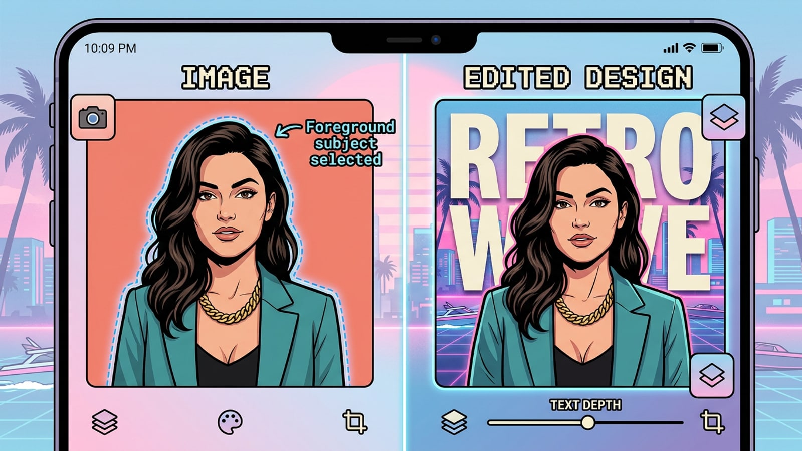
Direct Answer: The 3-Layer Mobile Depth Stack Mechanics
Understand how spatial sandwich layering creates a convincing 3D depth effect on iPhone without specialized desktop rendering software.
The optical illusion of text floating behind a person in a photo does not require complex 3D rendering engines or desktop graphics software. On iPhone, this spatial effect is constructed using a strict 3-layer visual canvas sandwich. By positioning bold typography in the midground space between your base photo and an isolated foreground subject cutout, the human eye perceives physical depth instantly.[1]
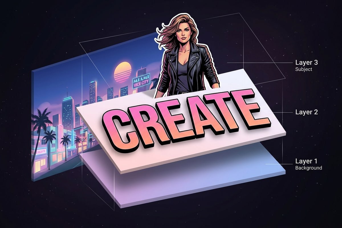
Achieving this effect seamlessly depends on exact structural alignment across three parallel canvas layers. The bottom layer acts as the complete scene, establishing background lighting and mood. The middle layer holds your styled vector typography. The top layer consists of an isolated high-precision subject cutout positioned in exact alignment over the base image. Because the top cutout hides portions of the middle text while matching the background behind it, the letters appear physically embedded inside the physical environment.[1]
- Layer 1 (Bottom Canvas): The original portrait photo providing background context, environmental lighting, and perspective.
- Layer 2 (Middle Canvas): Styled text overlay configured with designated font weights, letter spacing, and spatial alignment.
- Layer 3 (Top Canvas): Non-destructive subject cutout extracted via native iOS subject lifting or on-device background removal.[1]
Preparing Foreground Cutouts with Native iOS Subject Lifting
Isolate foreground portrait subjects using built-in Apple iOS lift-and-cutout capabilities before building your layer stack.
Before assembling a 3D depth stack, you need a precise foreground cutout of your portrait subject. Modern iPhone models feature built-in subject lifting capabilities directly within the native Photos app, enabling instant subject extraction without manual tracing tools.[1]
Extracting your subject natively preserves full image resolution and fine edge detail. Once copied or saved as an image asset with background transparency, this cutout serves as Layer 3 in your mobile editor.[1]
Step-by-Step Tutorial: Assembling the Layered Canvas on iPhone
Follow this non-destructive mobile workflow to position background photos, edit bold typography, and snap subject cutouts in sequence.
Once your base photo and subject cutout are ready, assembling the 3D typography stack takes less than two minutes. You can build this visual layout using flexible mobile tools like Cara's Free Creative Canvas, which runs locally on iOS and iPadOS.
Using an on-device canvas editor lets you arrange non-destructive image and text layers, tweak letter spacing on the fly, and align top cutout elements without cloud rendering delays.
- Save both your original portrait photo and extracted subject cutout to your iPhone Photos library before beginning canvas assembly.[1]
- Keep your canvas zoom centered so you can verify outer text placement and edge boundary alignments simultaneously.
- Step 1: Open the Canvas and Place the Base Photo
Launch Cara, open the Free Creative Canvas, and import your original unedited portrait photo as your base canvas background (Layer 1).
- Step 2: Add and Style Midground Typography
Tap Cara's Text Editing and Overlay tool to add your headline text. Select a bold font weight, scale the lettering across the subject's upper body, and position the text layer directly above Layer 1.
- Step 3: Align the Foreground Subject Cutout
Import your extracted iOS subject cutout onto the canvas as Layer 3. Scale and snap Layer 3 directly over Layer 1 so that the subject's edges align exactly with the background image beneath the text.[1]
Editorial Typography & Font Pairing Rules for Spatial Depth
Master font selection, tracking, color contrast, and real-world font pairings to keep text readable while enhancing visual depth.
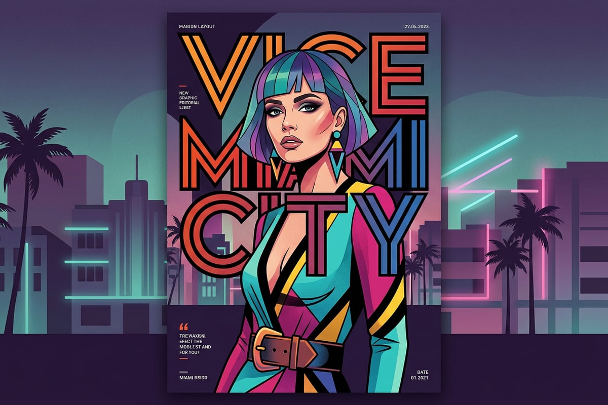
The secret to striking editorial depth graphics lies in balancing spatial realism against readability. Placing large typography behind a subject naturally covers portions of the word. If too much text is occluded, the design becomes unreadable; if too little is covered, the 3D depth illusion feels weak.
As a practical design rule, typography placed behind portrait subjects generally retains legibility as long as at least 60% of key character strokes—specifically initial capital letters and upper ascenders—remain unmasked. As long as primary stems peeking through negative space reveal word structure, the human visual system reconstructs the complete word automatically.
To elevate your mobile design from a basic edit to a magazine-grade layout, pair your occluded midground headline with complementary secondary typography. Different visual styles call for distinct font combinations:
- Editorial Fashion & Poster Style: Pair a ultra-bold geometric sans-serif (such as Montserrat ExtraBold or Futura Bold) in all-caps tucked behind the subject with an elegant high-contrast serif (such as Playfair Display or Bodoni) for unmasked subheadings in front.
- Streetwear & Modern Magazine Style: Pair a condensed industrial display typeface (such as Bebas Neue or Impact) spanning across the subject's neck with a clean, low-contrast neutral sans-serif (such as Inter or Helvetica) for small secondary metadata.
- Minimalist Lifestyle & Portrait Style: Pair a wide-extended light sans-serif with loose character tracking behind the subject with a subtle italic handwritten script accent positioned across the foreground.
- Color Contrast Pairings: Pair dark scene backgrounds with bright cream or warm off-white typography, or use high-saturation neon lettering behind cool monochrome portrait photography.
Troubleshooting Edge Masking and Alignment Errors
Resolve composite artifacts including hair edge halos, layer misalignments, and spatial depth breaks on mobile canvas editors.
While automated subject cutouts handle solid boundaries exceptionally well, complex edge textures such as fine hair or fur can occasionally display halo artifacts against dark background typography.[1]
If cutout edges look unnatural over midground letters, touch up the composite locally. Using Cara's Drawing and Brush Tools, choose a soft brush to blend subtle transition edges along hair contours directly on your canvas. Alternatively, if your background image contains unwanted distracting elements, you can pre-process the shot using an on-device face blurring workflow or subject cleanup before layering.
You can also customize your subject's styling prior to compositing. For instance, learning how to replace clothes and props in iPhone photos using AI prompts allows you to match wardrobe textures with your planned typography palette before building your 3-layer canvas.
- Misalignment Halos: Double-check that Layer 1 and Layer 3 share identical aspect ratio and scale settings before locking positions.
- Harsh Hair Fringe: Use low-opacity brush tools along dark text borders to soften automated cutout transitions.
- Unnatural Depth Separation: Apply a subtle drop shadow to Layer 3 to cast soft natural shadows onto the underlying typography layer.